Driving community engagement for local businesses.

Mad LADS
Lydia Shan, Andrew Tang, Dylan Brown, Saachi Shivdasani

Team

UX Writing
Design System
User Testing
Research Analysis
Mediator

Roles

4 months

Duration

Figma
Photoshop
Notion
Usertesting.com
Google Docs & Spreadsheets
Mural

Tools

This project was undertaken under the mentorship of our industry partner Yelp.

Yelp Inc. is a social platform that publishes crowd-sourced reviews about businesses.

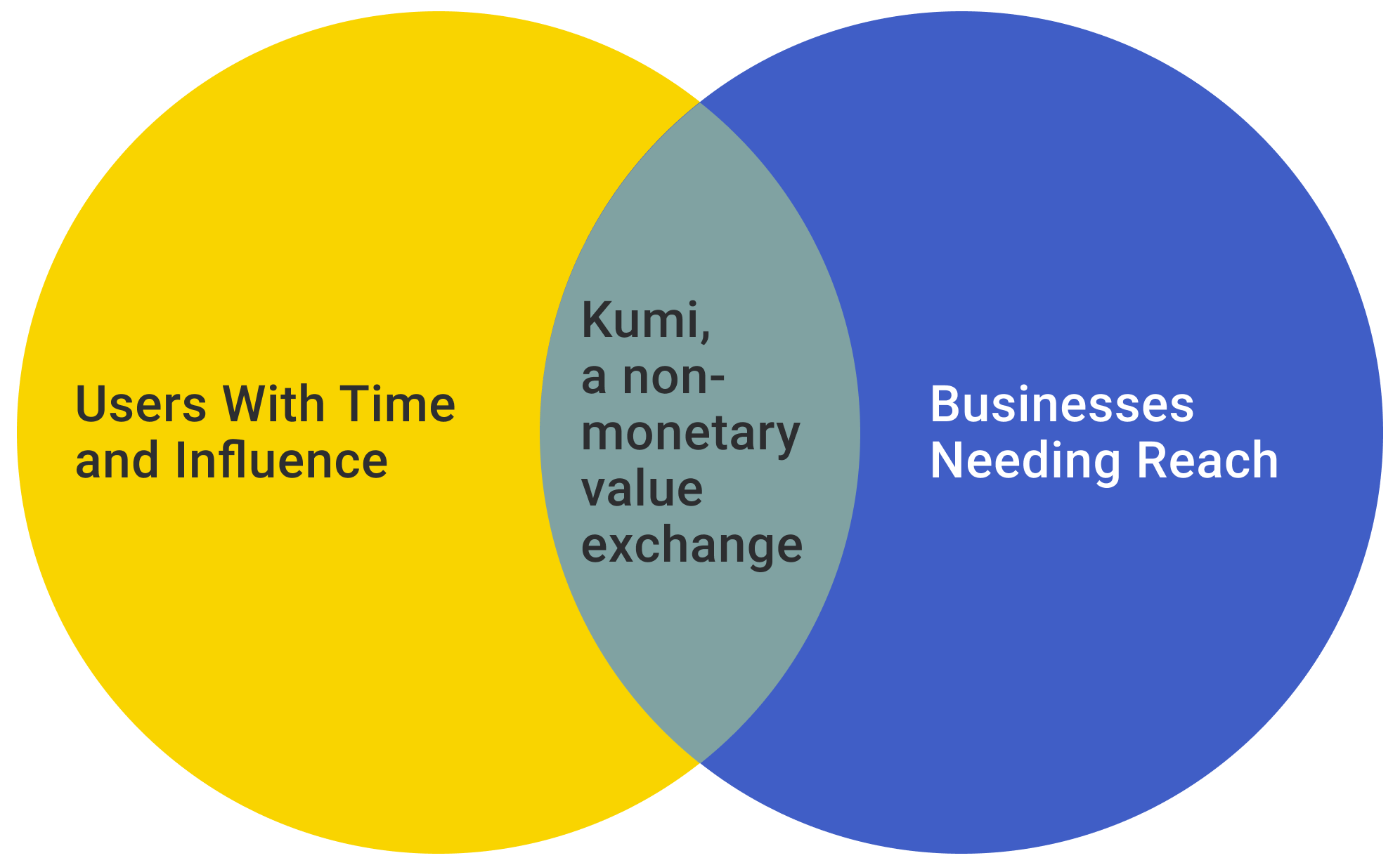
The Kumi rewards platform is a loyalty platform that supports small businesses by helping them create their own loyalty programs without having to build their own app or website. Additionally, it allows customers to support their local stores without necessarily incurring a cost.

The challenge.

How might we help consumers learn about the best spots in their neighbourhoods and share their experiences?

The problem.

After conducting interviews with 8 post-secondary students from the Greater Toronto Area, we determined that although students care about small businesses & want to support them, they are often unable to do so monetarily.

The solution.

To tackle this problem we designed an app that enables small businesses to create a loyalty program without the unnecessary cost of infrastructure and setup. Simultaneously, it helps the customers by rewarding them for spending in-store, checking in to the store and even sharing posts on social media.
Behind the screens.

Secondary research.

Our secondary research set the direction for our in-depth interviews. We were able to categorize our research plan into 6 distinct categories that we felt described the sense of community that small businesses bring to a neighbourhood.

In-depth interviews.

Why in-depth interviews?

We utilized 1-on-1 interviews to gain as much qualitative data as possible, taking into account our budgetary restrictions as students.

Research question.

How can individuals be engaged to strengthen their communities?

Participants.

Post-secondary students (ages 18-30) living in the greater Toronto area, having experience with both online and offline communities.

Sample interview questions.

Can you describe your ideal platform or method of engaging with your community (online, offline, etc)?

Is there anywhere within 1km of your home where it makes you feel like you’re a part of a community?

How do you find new locations, restaurants, events, and entertainment in your area?

Insights.

  • People want non-monetary ways to support small businesses.

    People feel connected to local businesses and want to contribute to their growth despite limitations. By providing new ways to support small businesses, people are no longer restricted in how they can engage with businesses.

  • People need to be provoked to engage

    People take on passive roles within a community unless they are provoked or given the initiative to do otherwise. Disagreements or passions & interests can push people out of their bubbles and engage or participate.

  • Opportunities to explore new cultures create engagement.

    People believe that diversity brings about new ideas and provides opportunities to learn about new cultures. These opportunities create engagement in the community through the exploration of new cuisines, activities and cultures.

User need stories.

  • As a user, I want a different way to support local businesses, so I can help them without spending money.

  • As a user, I want to have a way to support business online so that I feel like I'm supporting my community from home.

Personas.

Creating personas allowed us to clearly visualize our users and identify their pain points. This helped us kickstart our brainstorming.

Brainstorming.

To work on our project and team building, we met in person. It was definitely one of our better working sessions. To be able to bounce ideas off each other in real-time and use actual sticky notes rather than use mural boards, really enhanced our overall collaborative effort.

Meeting in person also allowed us to get to know one another better and connect outside of an academic setting. It was a great morale boost that enabled us all to refresh and celebrate our collective love of ramen.

Once we had our ideas down, we used a voting system to shortlist our ideas.

App map

We created a basic app map to direct our design process and create a detailed kanban in order to deliver our mid-fidelity screens.

Wireframes.

We created low-fidelity wireframes to get a general skeleton of what we wanted the app to look like. This helped us build the app to a mid-fidelity prototype for user testing.

Design system.

We created a design system before we stepped into the high-fidelity prototyping phase. This allowed us to have a clear vision of the app’s voice and appeal. It also allowed us to ensure consistency in our designs.

Branding.

Brand Name: Kumi

Origin: Japanese

Meaning: A group, party, pair, band

Brand personality: playful, inclusive, reliable

Watermark.

Logo and watermark.

Logo.

Yellow signifies joy and playfulness.

Cobalt blue signifies trust and loyalty.

Brand colours:

Colours.

Typography.

Assets & components.

UX writing

As UX writer for my team, I wrote quirky and playful copy that matched the app’s vibe. I was able develop my précising skills while attempting to communicate all information as clearly as possible.

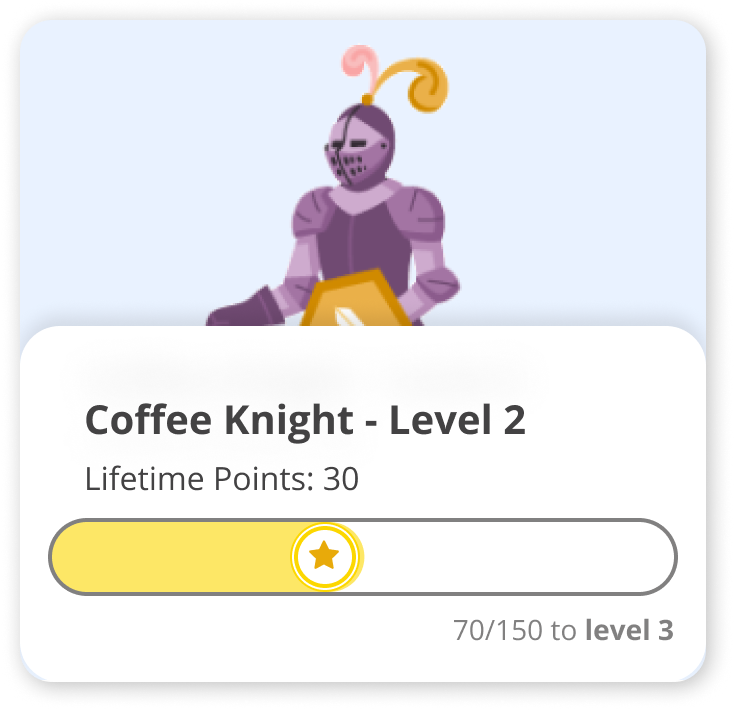
We even tested the quirky business membership tier names to see if they added an element of humour and fun. The idea was to create a clear definition of tiers to provide users will micro-satisfaction and bragging rights.

Usability testing.

We conducted 2 rounds of user testing with 2 test scripts each. This helped us test 2 separate flows within the app.

Round 1 - Pain Points

Scan was difficult to find and not intuitive to use

Call to action isn’t always clear

Lack of user feedback/ confirmation after action is completed

Share button is often missed

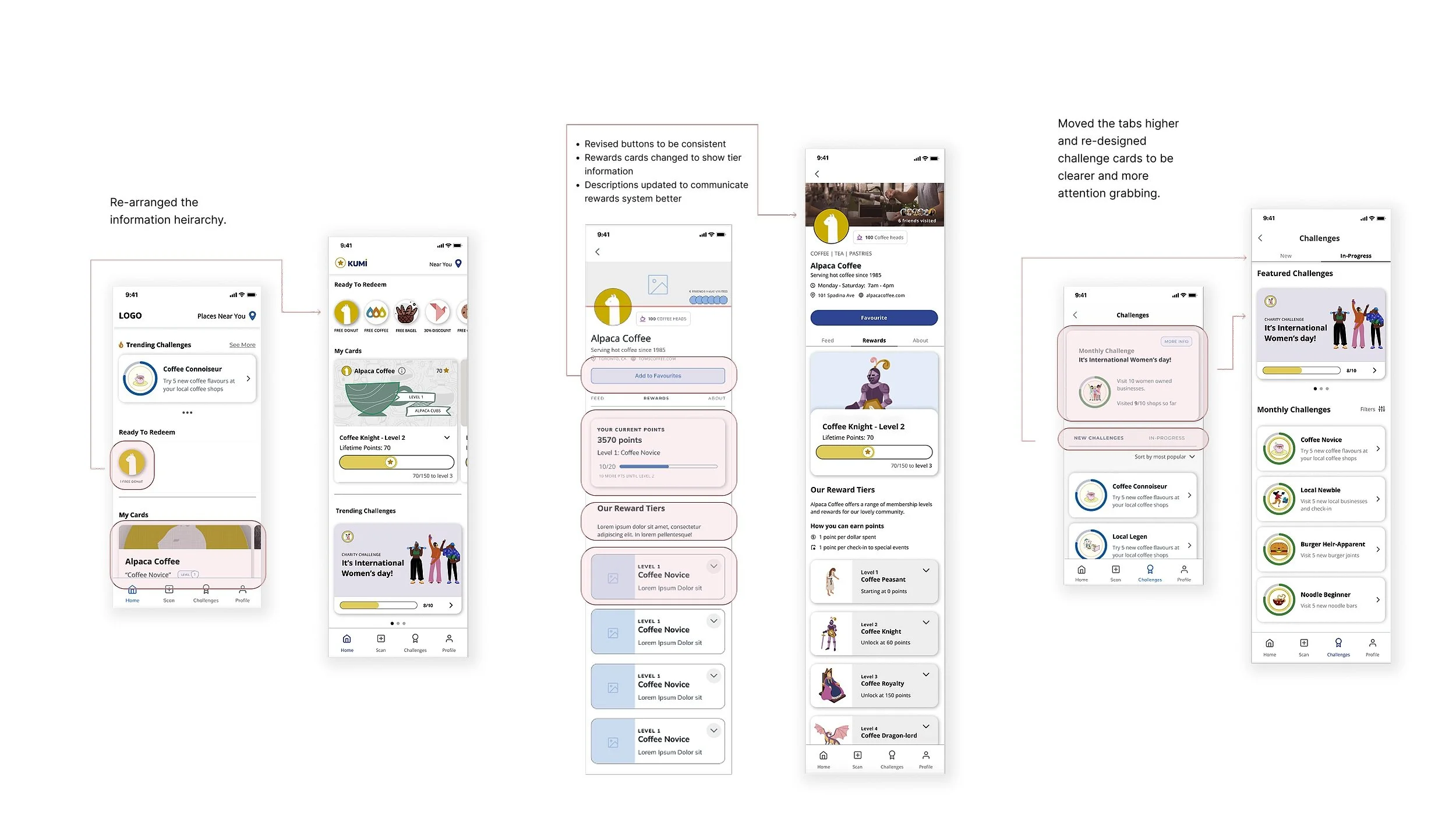
Homepage information heirarchy isn’t intuitive for checking user’s rewards cards.

Round 2 - Fixed

100% success rate for check-in task (Script 1)

Time to complete call to action steps reduced by 20%

Added success toasts which resulted in a 100% success rate on scanning and redeeming.

Lower variance from ideal task completion

Time to access wallet cards was faster by 25%

Round 2 - Pain Points

Business hours are not easy to find

Instructions to earn points don’t stand out enough

The difference between challenge and points system is unclear

Current membership couldn’t be easily found

Lack of total points earned so far in profile page

Dull branding

Lack of interactions

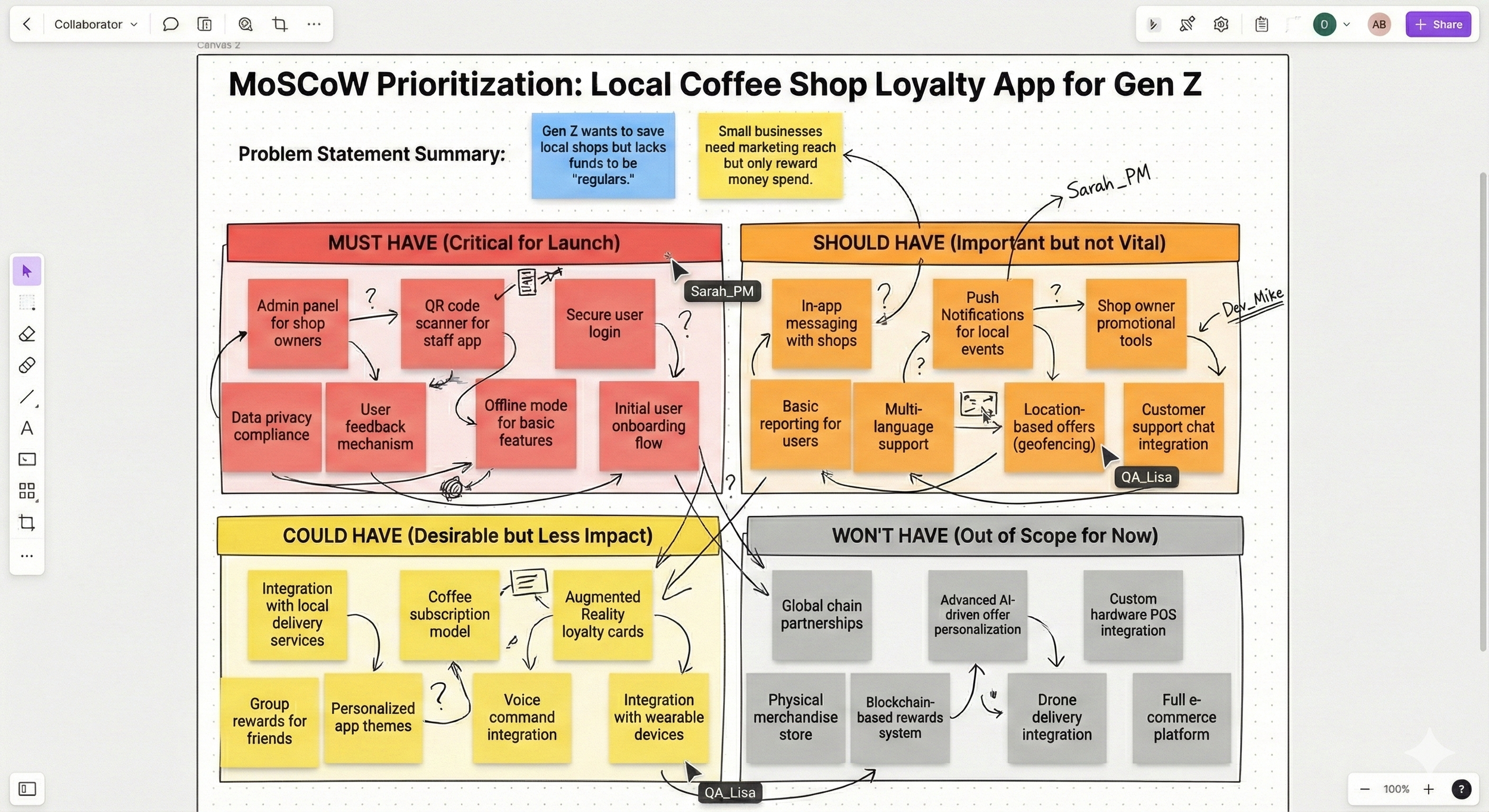
MoSCoW method.

We utilized the MoSCoW method to prioritize the feedback that we received for future iterations. Once we were able to determine what we must, should, could and won’t execute, basis our goals and limitations, we were able to refine our prototype.

Prototype iterations.

This phase of the design process also called for many refinements and finishing touches for our prototyping. We focused on adding personality, feedback and interactivity by mapping out transitions, special interactions and animations. Our group dedicated ourselves to learning more complex Figma prototyping skills so that we were able to create expanding cards, interactive buttons and scrollable carousels to give our app a true high fidelity feel.

Meet Kumi.

A deeper look into the app’s features.

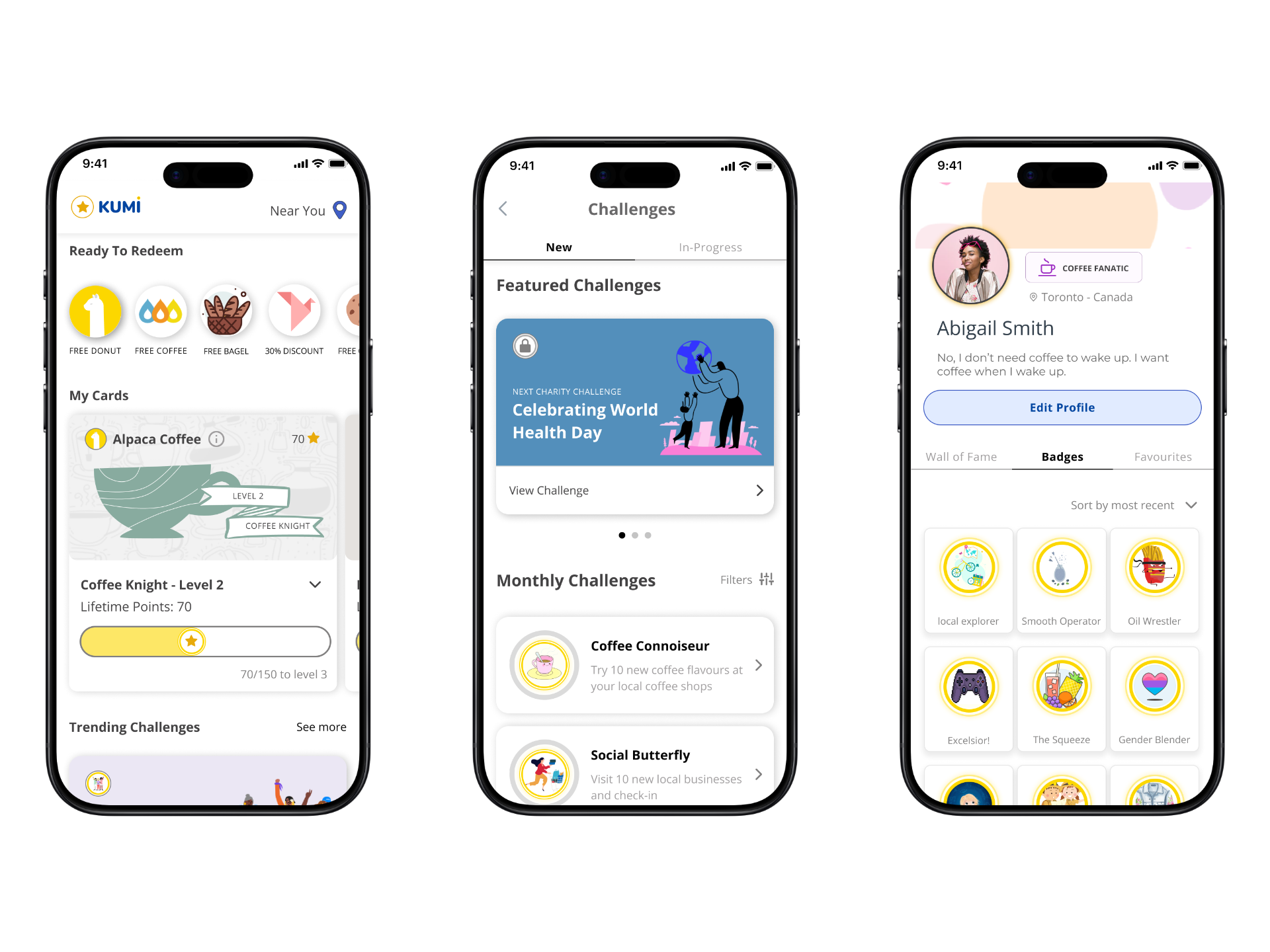
The home screen serves as the central point for users to access the loyalty programs they are a part of. They provide easy access to their available redemption offers.

The “near you” feature allows users to view businesses and challenges available nearby.

The navigation bar provides access to the profile, challenges: in-progress and new and the scan feature.

Home screen.

Challenges.

The challenges feature allows users to engage with users in non-monetary ways like walking into stores and “checking-in” through the app or online by posting a review or post on social media. Users are rewarded with unique badges that they can display on their profiles.

This also provides businesses with foot traffic and online engagement.

Profile.

The profile section acts as the central point for users to view their favourite businesses, badges and settings. The profile engages users by allowing them to display their badges.

Businesses.

Here users can meet the businesses they love. Apart from getting basic information, users can learn about their loyalty programs and understand their rewards systems in detail.

Lessons learned.

Be vocal about your opinions and ideas, it could be of use later if not now.

The way you put forth your opinion is important to effectively communicate and have your ideas accepted.

Let go of perfection to give way to new ideas.

I am great at diffusing potentially heated situations.