A very Narnian election.

This was an individual project.
Tools
3 months
Duration
Figma
Mural
Zoom
Microsoft Office Suite
Role
This was a project on accessible design to propose a digital solution that enhances the voting experience of a pandemic-ridden fictitious world.
Building on C.S. Lewis’ Narnia universe, I proposed a scenario to encourage my fellow students to get creative when I interviewed them.
The scenario.
After years of oppression from the monarchy, the Narnian population were finally able to establish a democratic nation that allowed its citizens to vote for their leaders. Then the pandemic hit.
The Narnians needed an efficient way to vote that could be accessed by citizens from even the remotest possible locations.
The problem.
On conducting interviews with people that lived in both urban and suburban regions of the nation, I was able to identify a key issue that they were facing. Remote areas of the country had no access to efficient public transport or a basic internet connection.
The solution.
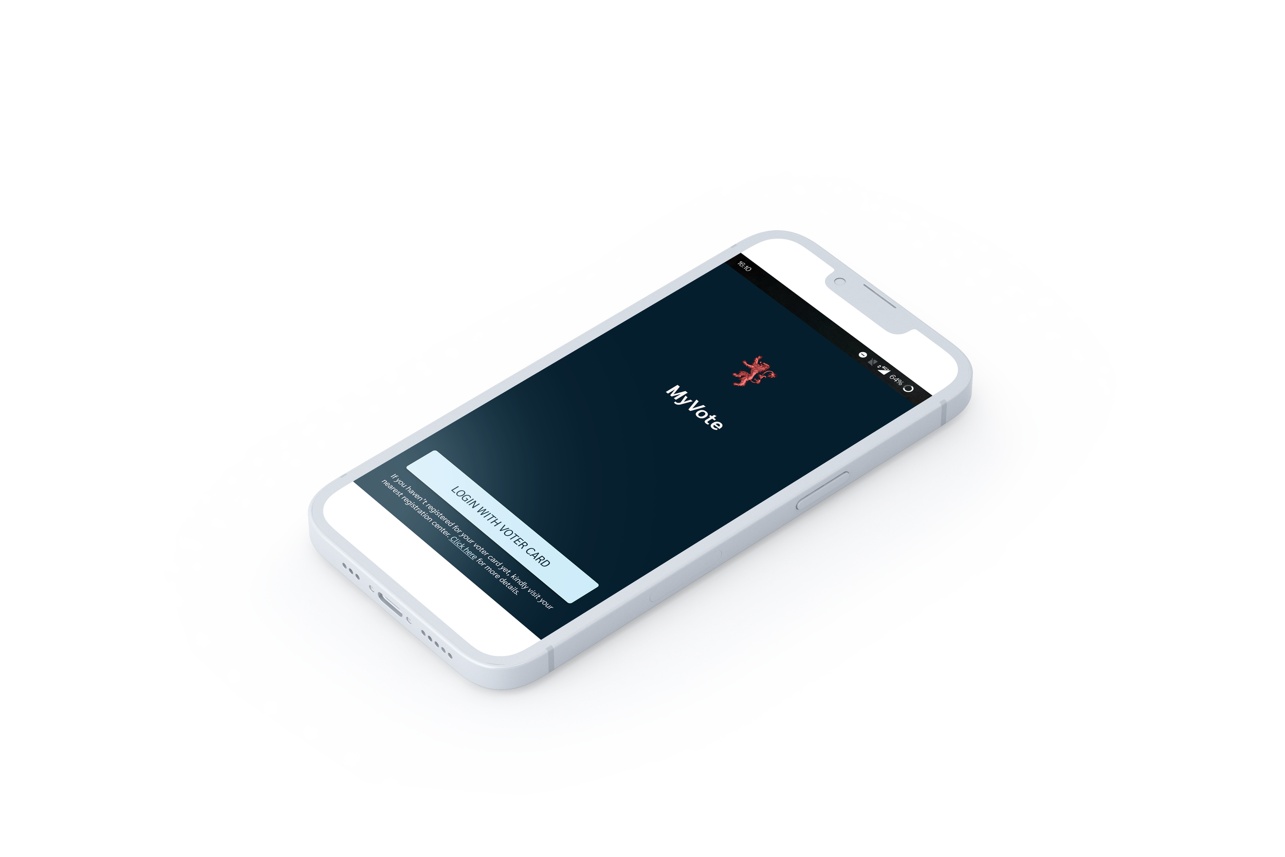
To address this accessibility concern, I devised a solution that would enable users to view a voting app in “low fidelity” when faced with connectivity problems, without affecting their ability to send their vote in.

Behind the screens.
In-depth interviews.
I conducted peer interviews with three participants, and was able to identify two distinct personas. One that lived in a more urban setting that faced overcrowding and another that lived in a remote suburb, that lacked proper transport and communication infrastructure.
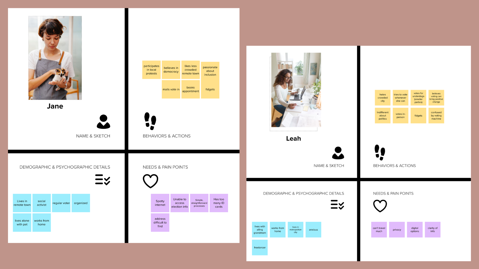
Personas.
With the information I gathered during the interviews, I was able to develop two distinct proto-personas. The first, Jane, a political activist that lives in a remote town and does not have access to appropriate transit or communication infrastructure and the second, Leah, a work-from-home freelancer that lives with her ailing grandmother in an urban city.

Journey mapping.
Leveraging all the information I had gathered, I proceeded to create journey maps for each persona to highlight their pain points and develop user needs stories.
User needs stories.
-

Jane
As a voter who lacks proper internet connectivity, I need to confirm my vote is submitted so I can ensure my vote is counted.
-

Leah
As a voter with an ailing grandmother, I need a contactless way to vote so I don’t unnecessarily expose her to illnesses during the pandemic.
Wireframes.
With my mid-fidelity prototype, I focused on making my product accessible to all the people in Narnia. By adding a lower fidelity mode that turns on when users are in a low network coverage area, users can vote regardless of where they are. The app stores your vote and uploads it when you have enough network.
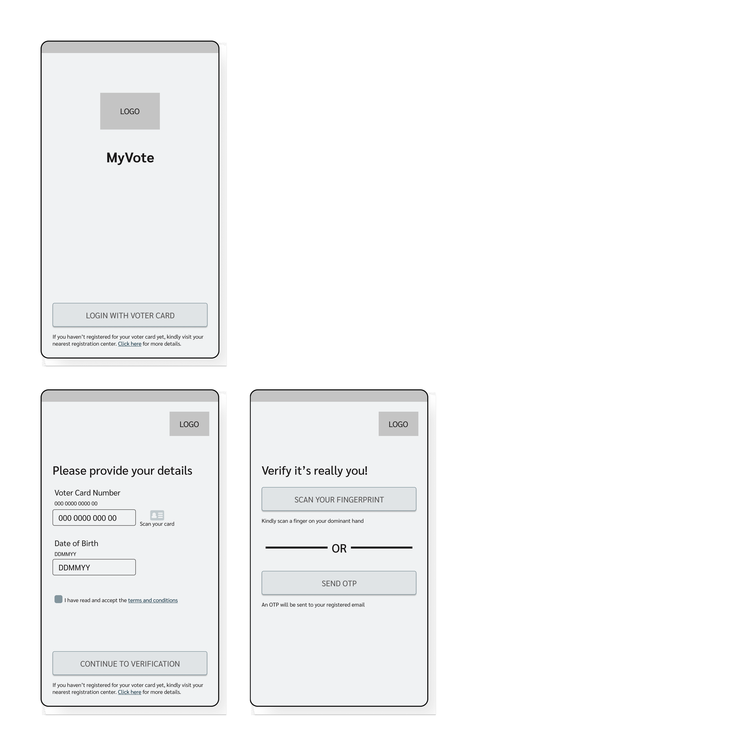
In order to prevent repeat voting, users needed a 2-factor verification. I considered various ways to incorporate it while considering that every user may not have access to a fingerprint scanner or even a phone.
I chose the language “dominant” hand to remain inclusive of people with accessibility needs.
Answering a security question and an OTP verification by cell phone number were a couple of the options I dabbled with. Eventually, I ended up going with an OTP sent through email.
Preventing repeat voting.
I wanted to make it easy for users to be able to navigate their way to their voting experience.
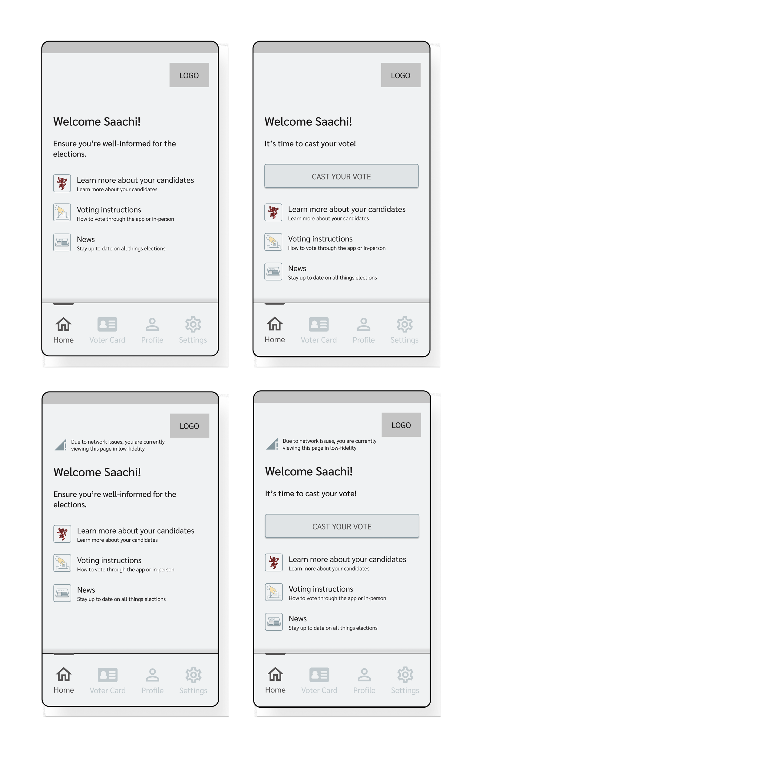
If a user was to log in to the app before election day, they receive the message: Ensure you’re well-informed for the elections
If they log in when voting is open, they receive the message: It’s time to cast your vote. This coupled with a button that can instantly take you to the voting screen will help users have a clutter-free voting experience.
Different messages for important days.

A simple vote casting screen that can also provide information.
The addition of the “more info” button is included in case users need a brush-up on any information regarding a candidate or his policies.
I added a confirmation screen with a clear “Go Back” option to ensure that users don’t mistakenly tap the wrong option.

Low-fidelity screens.
I added the small icon and message at the top of the page to let users know when the app is being viewed in low fidelity.
The choice to use simple colours instead of images in low-fidelity mode was to reduce the load on the user’s connectivity.
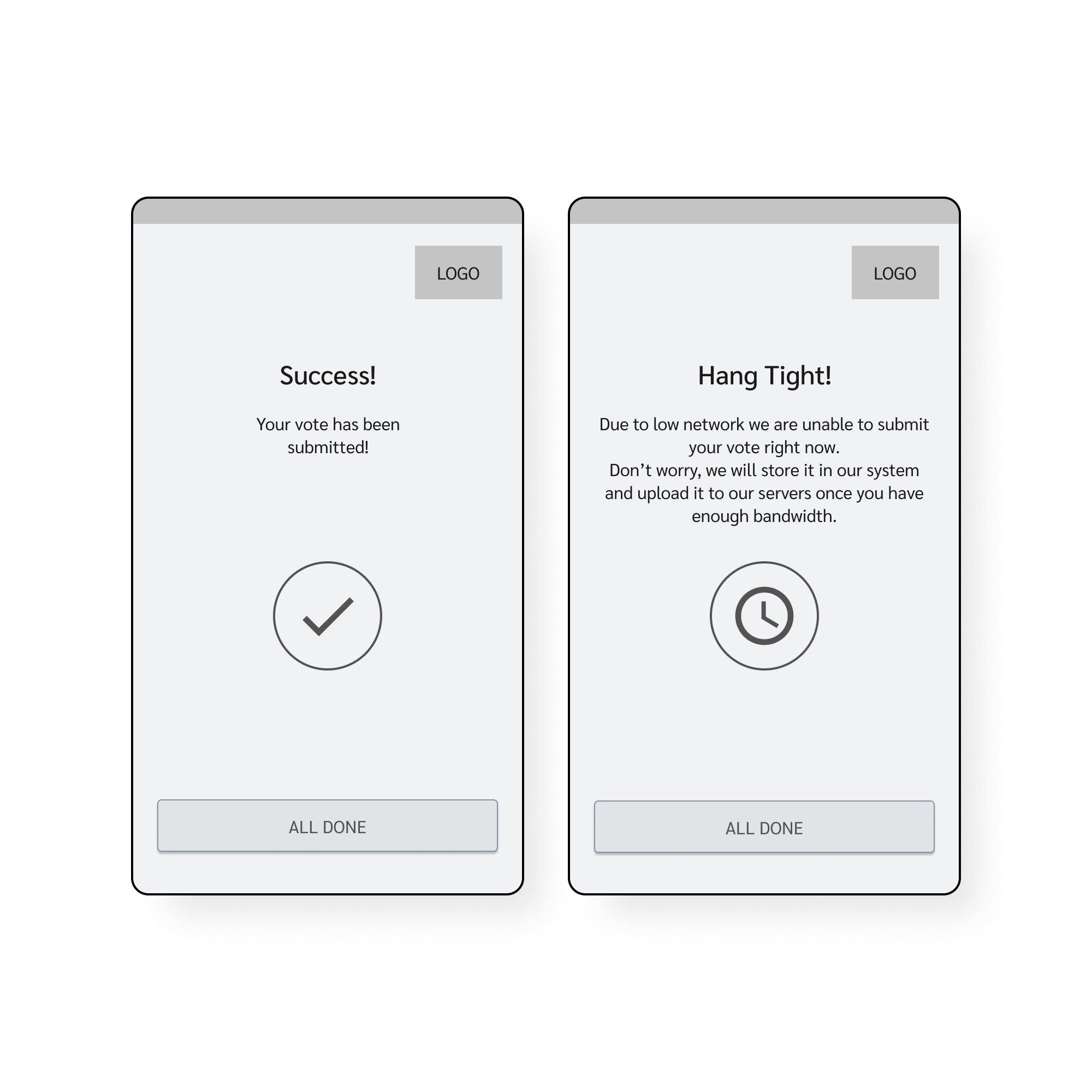
Varied submission completed screens.
The difference in the submission screens for users in the high vs low fidelity mode is highlighted here.
The app provides uniques messages to enable a stress-free voting experience. For users viewing the app in low-fidelity, a message pops up letting them know that their vote has been stored to upload once they have enough network. However, they don’t need to do anything further.
Professor feedback.
While I had made the website accessible for those suffering from low connectivity issues, some screens had failed to comply with screen reader requirements. Along with this feedback, I kept in mind the visual accessibility of the colours when making my high-fidelity screens.
Accessible colours.

When choosing my colours, I challenged myself to play with the Narnian flag colours. “A red lion on a field of green” was my brief. Keeping this in mind and adding in the need to ensure each colour was AAA compliant felt like a mammoth task at first but turned into quite a fun exercise for me.